
February 11, 2026
Web Design That Converts: Why Pretty Without Strategy Doesn't Sell
Does your website look good but generate no clients? Discover why design without a conversion strategy is a cost, not an investment — and how to fix it.
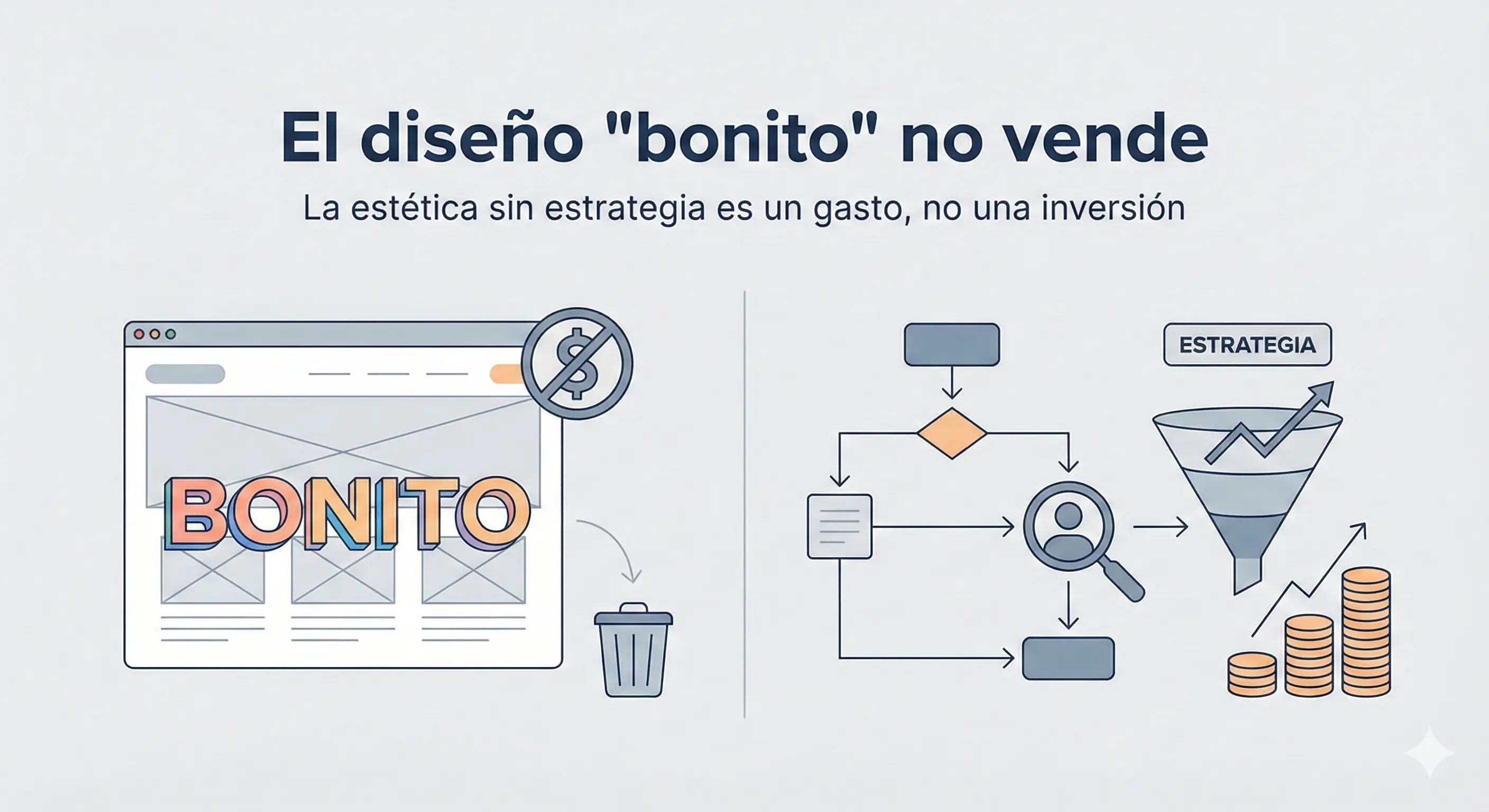
There’s a trap a lot of companies fall into when they decide to invest in their digital presence: confusing pretty design with design that works.
They pay someone to build a “modern” site, with animations, gradients and trendy typography. They present it in a meeting and everyone says “this looks incredible.” They launch it. And sales don’t go up.
Why? Because design without strategy is decoration. And decoration doesn’t convert visitors into clients.
In this article I explain why purely aesthetic design can be the worst enemy of your revenue, and what actually moves the needle.
The difference between UI and UX: the most expensive mistake in digital
Before getting into causes, you need to understand a fundamental distinction many agencies deliberately don’t explain:
UI (User Interface) is how your site looks. Colors, typography, icons, animations. It’s what most people call “design.”
UX (User Experience) is how it works and how it feels to use. Navigation structure, the flow to reach a purchase, how easy it is to find what you’re looking for, how many clicks a user needs to contact you.
A site can have flawless UI and disastrous UX. It looks good, but nobody knows how to navigate it. Calls to action aren’t in obvious places. The contact form has 15 fields. Checkout has 6 steps.
The result: the user leaves with a good visual impression but without converting.
And your “less pretty” but better-structured competitor gets the customer.
5 reasons pretty design doesn’t sell
1. The visual trap with no purpose
A website can be a work of art, but if the user doesn’t know what to do next after it loads, it’s a commercial failure.
Design should guide the user toward a specific action: buy, sign up, call, request a quote. Every visual element needs a role in that flow. Animated backgrounds, elaborate parallax and sophisticated transitions look good in a designer’s portfolio, but they can distract the user from what matters.
The question to ask about every design element: Does this help the user reach conversion, or does it distract from it?
If the answer is “it distracts,” cut it.
2. Owner bias: you design for yourself, not your customer
This is the most human mistake of all. You have a meeting with the designer, see a few proposals, and pick the one you like best. Or the one your team likes. Or the one you think best projects your company’s image.
The problem is you’re not the user. Your customer has different priorities, different levels of familiarity with technology, and different questions when they land on your site.
In conversion design, the owner’s preferences are irrelevant. What matters is data: what the real user does when they land on the page, where they click, where they stop, where they leave.
Companies that make design decisions based on data convert more than those that make decisions based on taste. Without exception.
3. Too many visual elements paralyze the decision
Consumer psychology has a well-documented principle: when there are too many options or stimuli, the brain enters paralysis and the easiest response is to do nothing.
Sites overloaded with visual elements, multiple CTAs, banners, pop-ups and animations generate exactly that. The user feels like they have to process too much before deciding, and the simplest decision is to close the tab.
Strategic simplicity is the opposite principle: show exactly what’s needed, in the right order, to take the user from “I landed on this site” to “I’m contacting this company” with the least friction possible.
Less is always more, as long as that “less” is placed with surgical precision.
4. Ignoring speed in the name of design
Here the trap is direct: many “pretty” designs are slow. Video backgrounds, custom fonts loaded from multiple sources, heavy animation libraries, uncompressed images because “compressing them loses quality.”
We already covered how much a slow site hurts your sales in another article. But it’s worth repeating here: a design that sacrifices speed for aesthetics is sacrificing conversions for vanity.
Google doesn’t forgive it either. Core Web Vitals are an official ranking factor. A slow site drops in search results, no matter how spectacular it looks.
The ideal design is beautiful and fast. Those aren’t incompatible goals, but they require real engineering, not just drag-and-drop tools.
5. Not solving the user’s problem in the first 5 seconds
When a user lands on your site, they have a question in their head. It might be “does this company do what I need?”, “how much does it cost?”, “can I trust them?”
You have about 5 seconds to answer that question before the user decides whether to keep exploring or leave.
A design focused on aesthetics might spend those 5 seconds on an elaborate entrance animation, a hero with a slow-loading background video, and a generic headline that says something like “We transform your digital business.”
A strategic design uses those same 5 seconds to clearly communicate what the company does, who it does it for, and why they should choose you.
What conversion design actually is
Conversion design doesn’t sacrifice aesthetics. It uses aesthetics as a tool to reach business goals.
In practical terms, it means:
Clear visual hierarchy. The most important element on the page (usually the headline and main CTA) is visually dominant. The user instantly knows what to read first.
Logical information flow. The page tells a story: first the problem you solve, then how you solve it, then why you’re the best choice, then what the user should do now. Not the other way around.
CTAs impossible to ignore. Call-to-action buttons have high contrast, specific text (“Request a free quote” instead of “Submit”), and appear at the right moments in the flow.
Minimal forms. Every extra field in a form reduces submission rate. If you only need name, email and message, don’t ask for address, phone, company size and estimated budget.
Social proof at the right moments. Testimonials and client logos don’t go decoratively at the end of the page. They go at the points where the user has the most doubts about whether to trust you.
How to tell if your current design has conversion problems
You don’t need to be a designer to spot warning signs. Ask yourself these questions:
Do you know your current conversion rate? If you don’t have Google Analytics or similar set up, you literally don’t know if your site is working. This is the first thing to fix.
How much time on average do users spend on your site? If the average is under 30 seconds, something isn’t working: either the traffic arriving isn’t the right kind, or the message doesn’t hook them.
How many clicks does a user need to contact you? It should be a maximum of 2. More friction than that means you’re losing conversions.
Does it work well on mobile? Open your site on your phone. Does it look good? Are the buttons easy to tap? Is the text readable without zooming? Most web traffic today is mobile.
Does someone who doesn’t know your company understand what you do in the first 5 seconds? Show your site to someone who doesn’t know your business. Ask them what the company does after 5 seconds. If they can’t answer, you have a clarity problem.
The real cost of a site with no conversion strategy
Let’s put real numbers on it. Imagine you invest $500/month in Google or Meta ads and generate 500 monthly visits to your site. With a 1% conversion rate (poor), you get 5 leads a month.
If you improve the design and conversion strategy to reach a 3% rate (good but achievable), with the same ad budget you get 15 leads a month. Triple the results without spending a dollar more on advertising.
That difference between 1% and 3% is exactly what separates a site that “looks good” from one designed to convert.
Conversion strategy: the real differentiator
In modern software engineering, design is a tool, not the end goal. Visual beauty and commercial effectiveness aren’t opposites: when executed correctly, they reinforce each other.
At NmSoftwareLab, every design project starts with the same questions:
- What does the user want to accomplish when they land here?
- What does the business want to accomplish?
- What’s the shortest, clearest flow to align both goals?
The answers to those questions dictate every design decision. The result is something that looks good and converts.
Is your current site a cost or an investment? If you feel your design isn’t converting visits into customers, let’s talk. We’ll give you an honest evaluation of what’s failing and how to fix it.
 NmSoftwareLab · CR
 Looking for a nearshore
software company?
Book a free 15-min discovery call. We'll tell you if your idea is viable, what it costs, and how long it takes.
Book a free call NmSoftwareLab · CR Ready to scale
your product?
We design and build solutions that turn users into loyal customers.
Start a project